
Case study
Rosa Bello
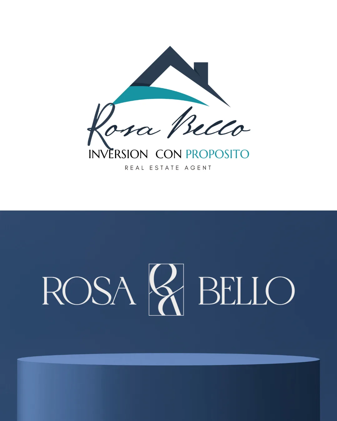
A personal real-estate brand rebuilt around the person — a one-line monogram, navy and gold, and a message that leads with her judgment.
About this project
Rosa María Bello came to Alma with a brand that had one big problem: it looked like every other real estate business in Florida instead of looking like her. She's a Broker Associate, she's CIPS certified, she's spent over 20 years running businesses, she founded ONCE (Orlando New Construction Expo), and she wrote a book, Dos Caras de la Llave. But none of that showed up. Her old site led with listings and generic investment language, so the properties became the story and Rosa became an afterthought. She felt it too, and told us it looked amateur, blended in with everyone else, and looked cheaper than the service she actually gives. It was also trying to talk to all of Florida at once, so it wasn't really connecting with anyone.
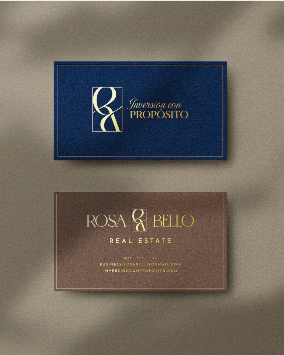
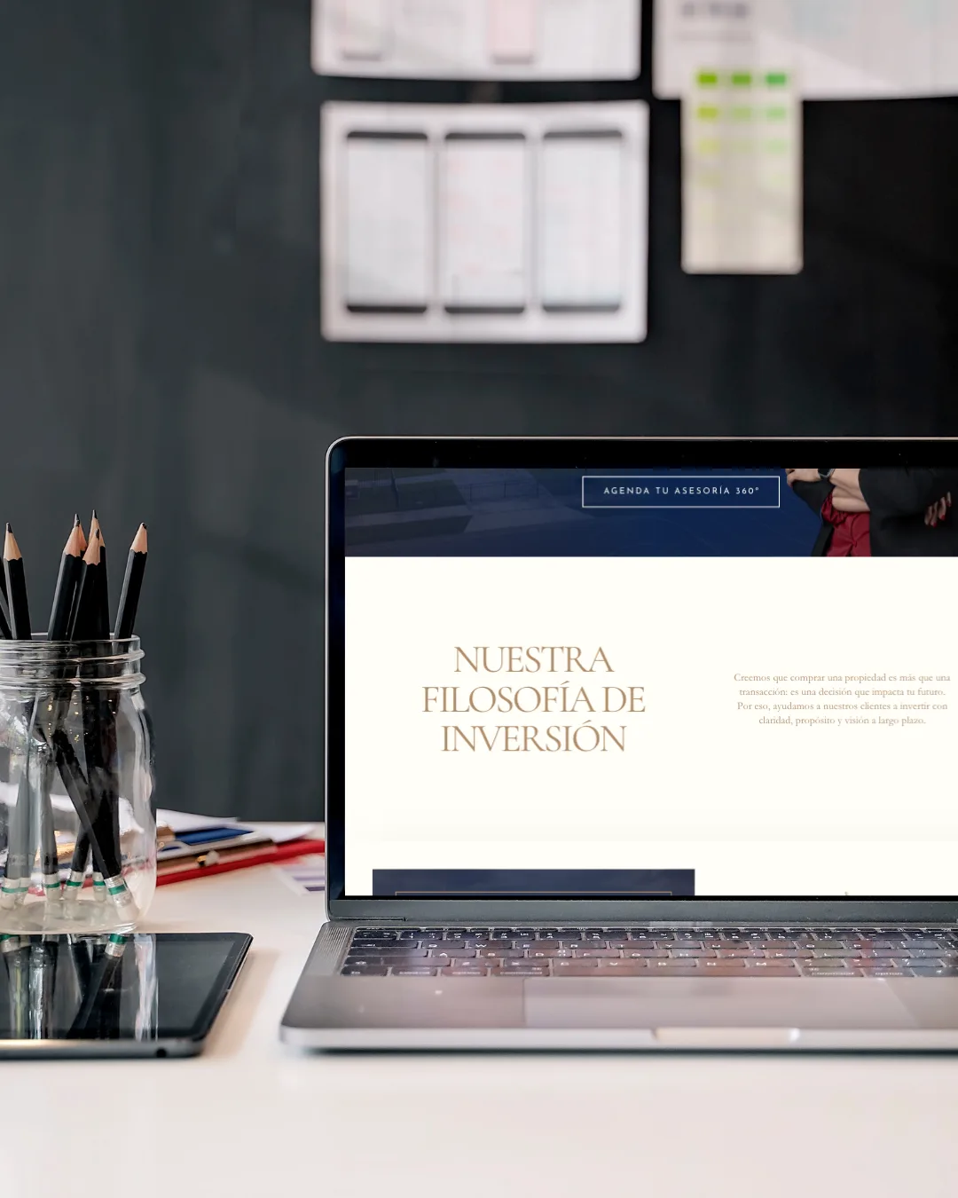
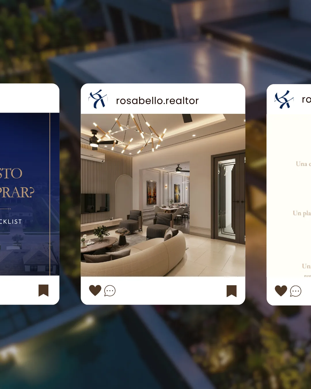
So we flipped it around and built the brand around Rosa, with real estate as just one piece of what she does. The homepage now leads with who she is so people understand why she's worth listening to before they ever see a listing, and the message changed from selling houses to helping people through one of the biggest decisions of their lives: "No vendo casas. Acompaño decisiones." Anyone can find listings, but they can't find her judgment anywhere else. The look changed too, away from the usual real estate clichés and toward something cleaner, more editorial, and more personal. It feels like Rosa at her best instead of like a template.
Gallery

In Alma's words
What changed
The result is a brand that finally matches the person behind it. Rosa isn't just another agent with a nice logo. She's an advisor, a broker, a businesswoman, an author, and someone who actually builds things in her industry. Very few people can claim all of that, and now her brand says so. In a market full of look-alike real estate websites, hers stands on its own and gives people a real reason to choose her: not the listings, the location, or the price, but the way she thinks.
Next up
ACD America
A complete digital presence for an industrial valve distributor — engineered like the parts it sells.